
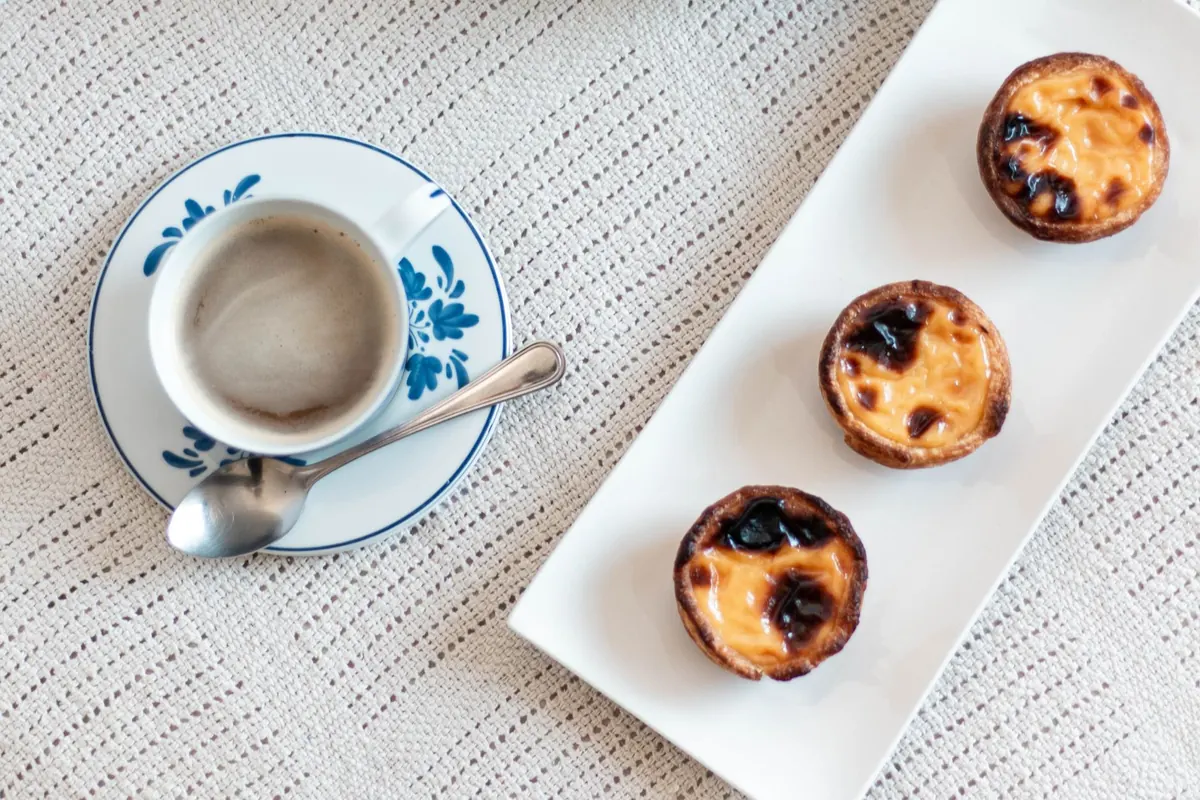


Why Your Custard Photos Look Grey: A White Balance Fix for Flan, Pudding, and Pastry Cream
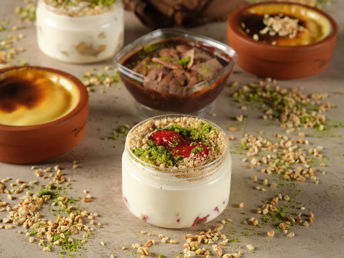
A crème caramel that glowed like amber in the kitchen comes back from the camera looking like grey porridge. A crème brûlée that tasted of vanilla reads as a plate of beige nothing. The dessert was fine. The light was fine. The problem was that the camera had no idea what "white" was supposed to mean in that scene, so it guessed — and it guessed against you.
Custard is one of the hardest subjects in dessert photography for exactly this reason. It sits in the yellow-to-cream range, it's usually surrounded by white plates and stainless steel, and it's often shot indoors under whatever light the kitchen happens to offer. Get the white balance wrong and every other edit you make is built on a bad foundation.
Why Custard Is a White Balance Trap
Cameras aim for an average that looks neutral. Point one at a large, soft, yellow-cream subject under warm indoor light and the camera's auto white balance does something reasonable-sounding: it assumes the yellowness is a colour cast and cools the image down to compensate. The custard goes grey or faintly blue. The whites around it stay white, which makes the whole frame look flat and lifeless, and no amount of contrast will bring the warmth back convincingly.
Auto white balance also drifts. Take ten frames of the same ramekin and you may get three slightly different versions of beige, because the camera re-evaluates every time you reframe. For a recipe post or a client gallery, that inconsistency is the real damage.
Read the Cast Before You Try to Fix It
Open the file at full size and look at the shadows first, not the custard. Casts are always most obvious in dark areas, and they're easiest to judge against something you know should be neutral.
- Grey cast with dull whites: the image has been cooled too far. The custard looks dusty and the plate looks slightly blue or lilac. This is the classic auto-white-balance result.
- Yellow cast: everything carries an amber tint, including the tines of a fork or a slate serving board. The custard may look fine on its own, but the surrounding neutrals give it away.
- Green cast: common with fluorescent tubes, some LED bulbs, and light bounced off green walls, foliage, or a green tablecloth. Green is the hardest cast to notice at a glance and the most obvious once you see it.
- Mixed cast — warm on one side, cool on the other: window light on the left, a tungsten lamp on the right. No single white balance setting will fix this. You have to change the light or accept it as a creative choice.
Underexposure makes all of these worse. Shadows are where colour noise and casts hide, so a custard shot that's half a stop dark will always look muddier and greyer than the same shot exposed properly.
Get It Right in Camera
Shoot RAW if your camera allows it. A raw file keeps the colour data intact, so a white balance change in editing is a clean adjustment rather than a destructive one. If you're working in JPEG, get the setting right on location, because you have much less room to move afterwards.
Turn auto white balance off. Choose a preset that matches the light — daylight, shade, tungsten — or better, set the colour temperature manually in Kelvin. Under ordinary window light, something around 5000–5500K is a sensible starting point; under warm household bulbs, start near 3200K and adjust. Then take a test frame, look at it, and nudge the number until the white plate reads as white and the custard reads as cream rather than neon.
The one thing you should never do is white balance off the custard itself. It's yellow. It's supposed to be yellow. Balancing to it will force everything else in the frame to go cold and blue.
Pick a Neutral Reference You Trust
A grey card is the reliable answer, and a small one lives happily in a camera bag for years. Hold it in the same light as the dessert, facing the camera, and use it to set a custom white balance or to sample in editing. A piece of white printer paper works in a pinch, though it's often brightened with optical whiteners that skew slightly blue.
Without a card, look for genuine neutrals already in the frame. A stainless spoon bowl, a grey slate tile, the unglazed foot of a ramekin, a grey linen napkin. Be careful with white plates: many are cream, ivory, or slightly blue-white, and a plate that isn't truly neutral will send you in the wrong direction. If you use a white plate as your reference, make sure you know what it looks like in daylight first.
The Edit: Four Sliders That Do the Work
Once you're in your editing app, work in this order and resist the urge to jump around.
- Temperature. Move it in small increments — five to ten points at a time — watching the custard, not the background. Stop when the cream stops looking grey and starts looking like cream.
- Tint. This handles the green-to-magenta axis. If the custard looks sickly, nudge toward magenta. If it looks pink and candy-like, go the other way. A tiny adjustment goes a long way.
- Exposure, then whites and blacks. Set the overall brightness, then place your white point on the brightest highlight that still holds detail and your black point on something genuinely dark. This restores the depth that a cast flattens out.
- Targeted saturation. If the yellow is still too loud after balancing, take down yellow and orange saturation slightly in the HSL panel rather than desaturating the whole image. That keeps the plate and napkin clean while calming the custard.
Don't aim for a pure white custard. Custard should land somewhere between pale butter and a warm ivory. If you neutralise it completely you'll end up with something that looks like wallpaper paste, technically correct and completely unappetising.
When It Isn't White Balance
Not every grey custard is a colour problem. Three other culprits show up regularly. First, a dirty front element or a cheap skylight filter — hazy, low-contrast files that no slider will rescue. Second, light bouncing off a coloured surface: a red tablecloth under a glass ramekin will tint the custard from below, and no white balance setting will separate the two. Third, steam. If you shoot a warm flan straight from the oven, steam softens highlights and reduces contrast in a way that reads as grey. Let it settle for a minute, or use a diffused light from slightly behind.
A Two-Minute Workflow You Can Reuse
Before the dessert comes out of the fridge, set your light, kill auto white balance, and take one frame with a grey card in it. Remove the card, shoot the dessert, then keep the same settings for the whole series so every image matches. In editing, fix temperature and tint first, correct exposure second, and only then start styling the look with contrast and colour. If you shoot this way every time, the grey flan problem disappears, and you'll spend your editing time on making custard look as good as it tasted.
Photo: Orhan Pergel / Pexels